Graphic Design & Art Direction
Personal design projects exploring print, packaging, and visual identity — from Bauhaus-inspired strategy cards to annual wine label art direction.
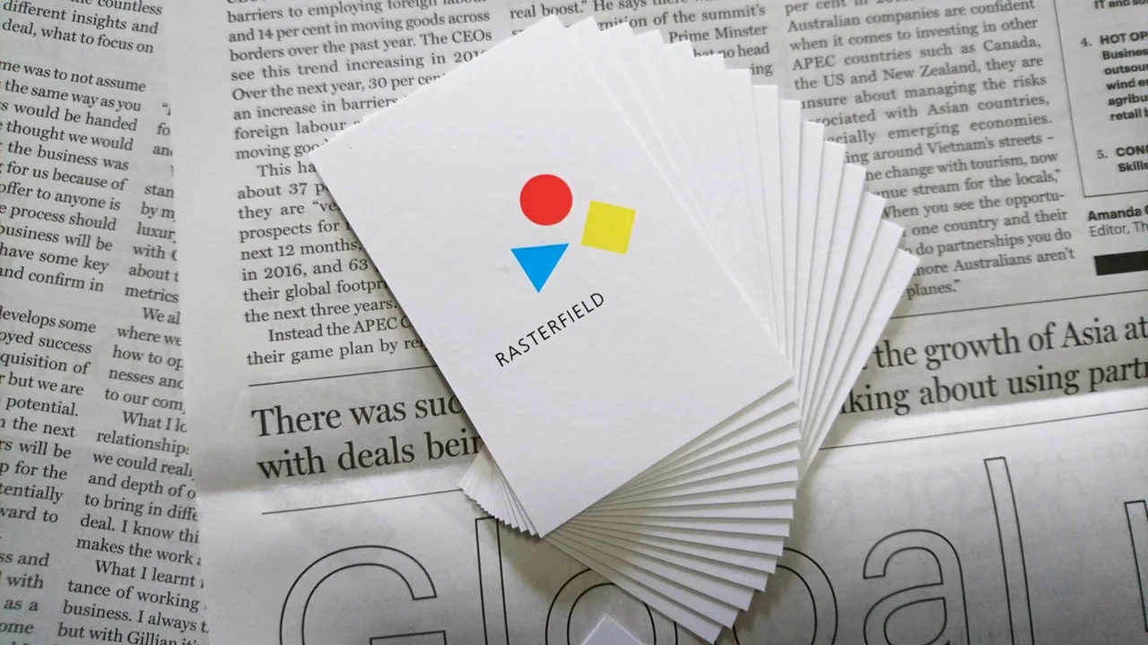
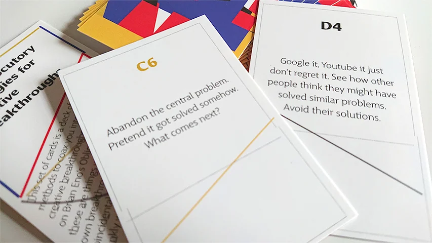
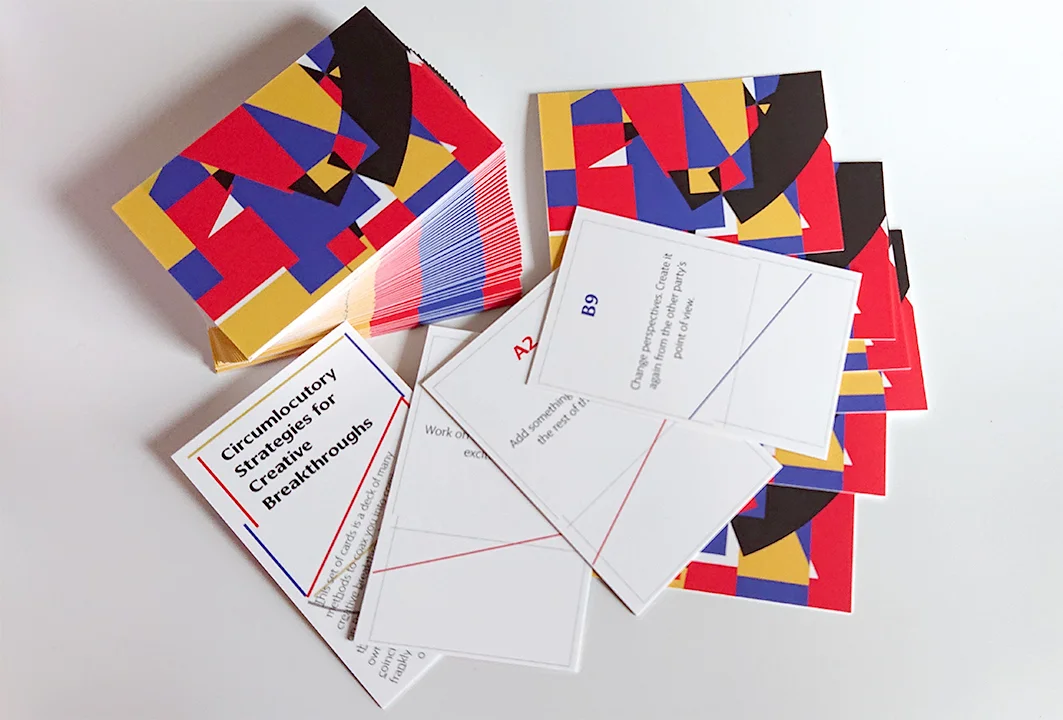
Circumlocutory Strategies for Creative Breakthroughs
Created 52 different messages to help or change your perspective on things when you are creatively blocked. The 52 messages are divided into 4 groups, 13 cards in each group. You can use them for playing card games. The design theme celebrates the 100th anniversary of Bauhaus, applied to colours and grid design.
This set of cards is a deck of methods to coax you into generating creative breakthroughs. It is loosely based on Brian Eno's Oblique Strategies, except these are things we've used to make our breakthroughs. Any similarities are coincidental and accidental.
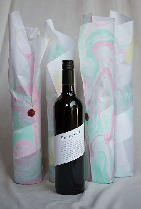
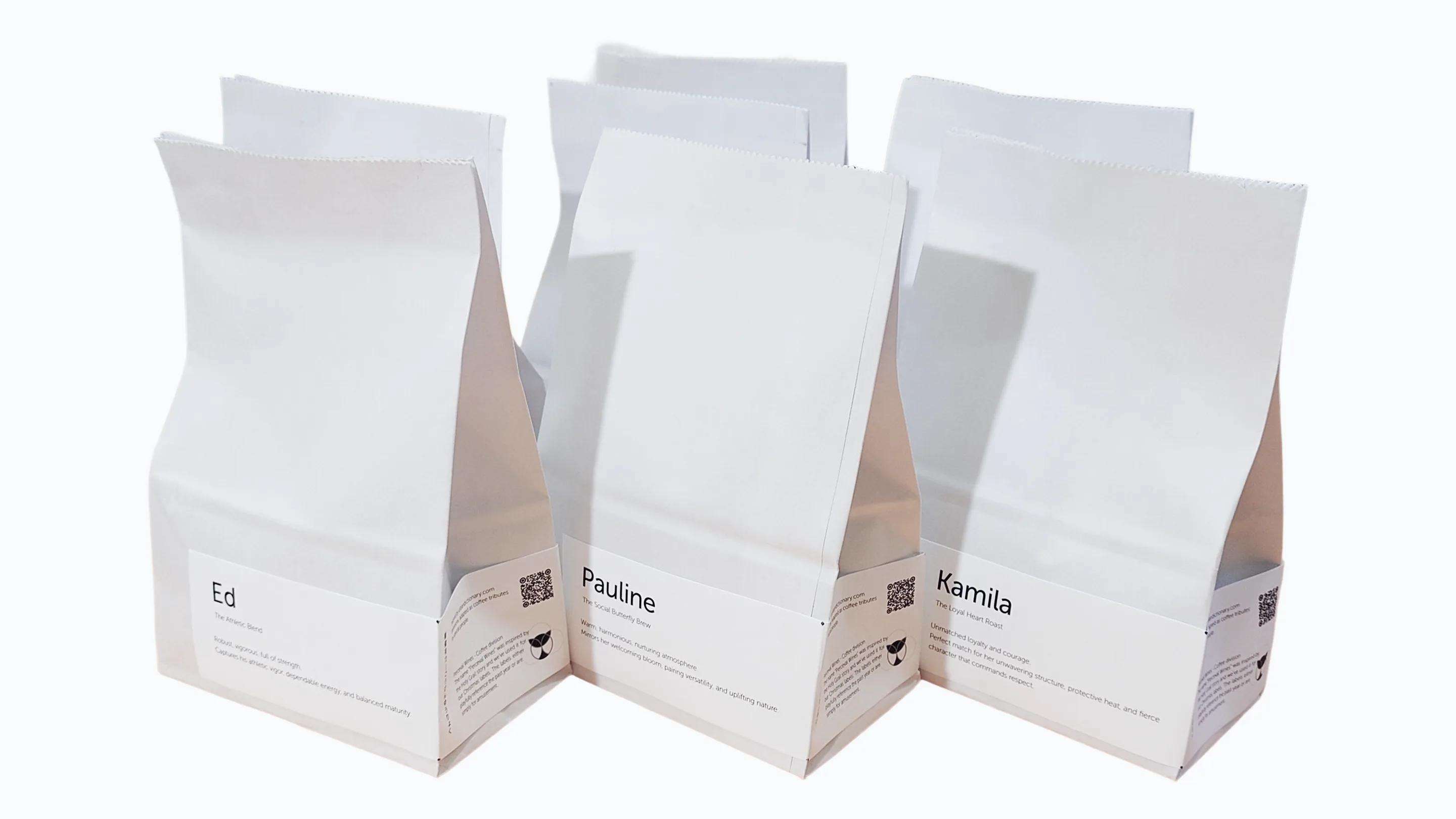
Perceval coffee
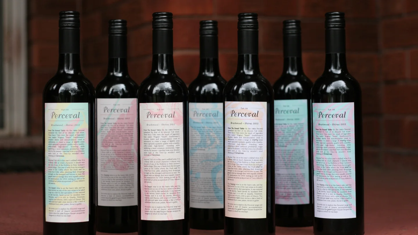
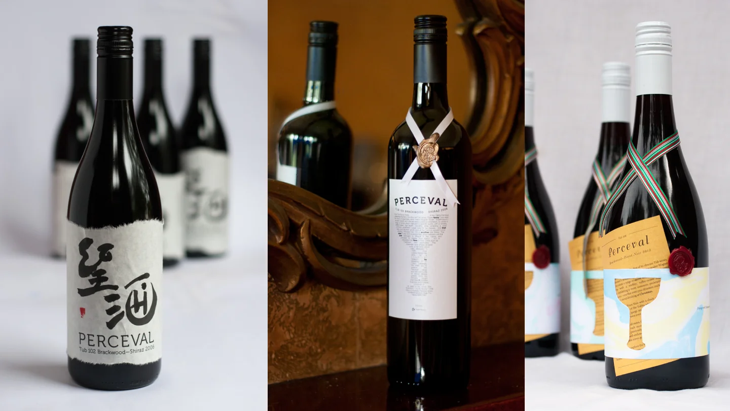
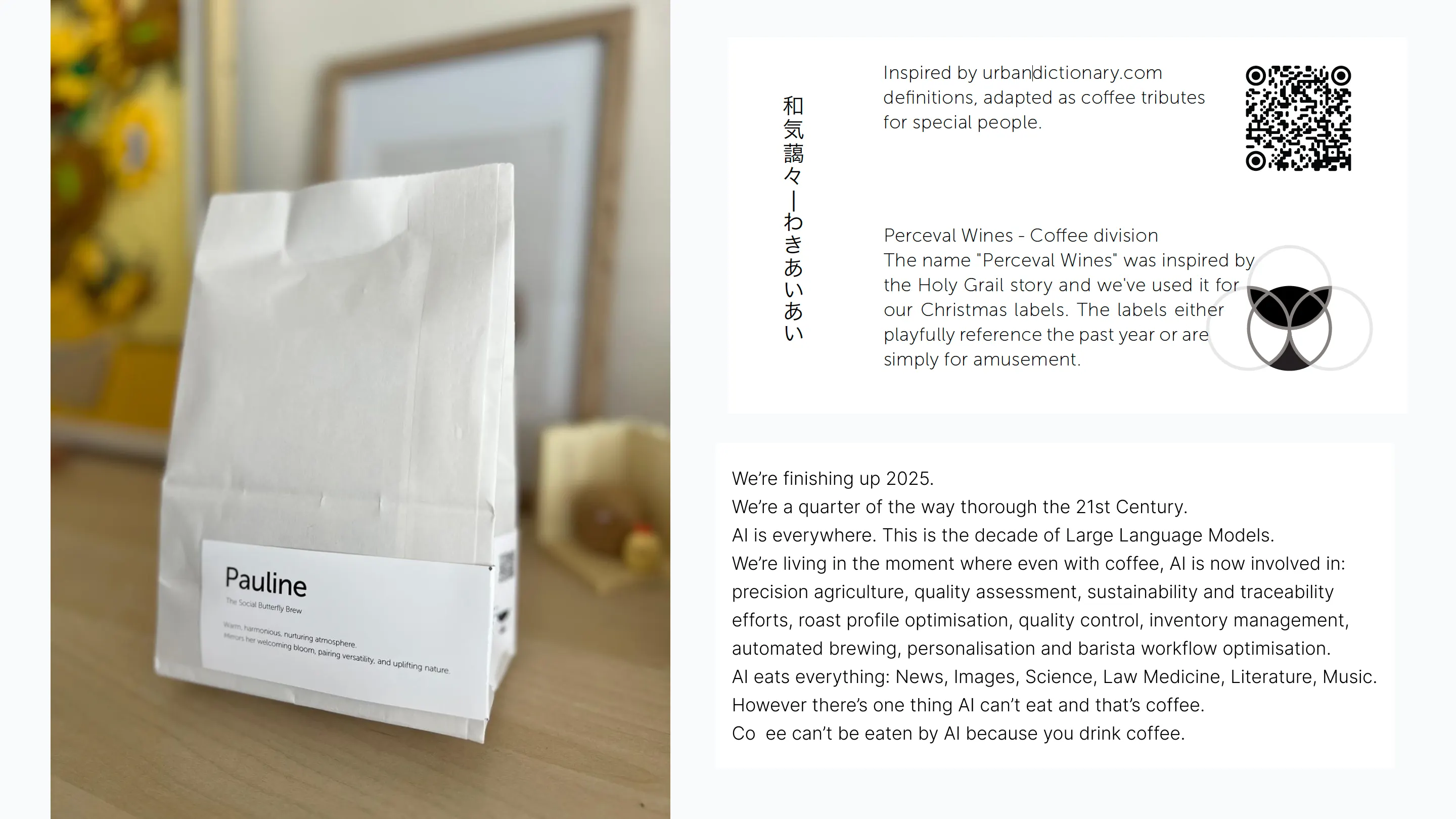
Inspired by urbandictionary.com definitions, adapted as coffee tributes for special people. Perceval Wines - Coffee division The name "Perceval Wines" was inspired by the Holy Grail story and we've used it for our Christmas labels. The labels either playfully reference the past year or are simply for amusement.
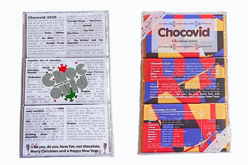
We’re finishing up 2025. We’re a quarter of the way through the 21st Century. AI is everywhere. This is the decade of Large Language Models. We’re living in the moment where even with coffee, AI is now involved in: precision agriculture, quality assessment, sustainability and traceability efforts, roast profile optimisation, quality control, inventory management, automated brewing, personalisation and barista workflow optimisation. AI eats everything: News, Images, Science, Law Medicine, Literature, Music. However there’s one thing AI can’t eat and that’s coffee. Coffee can’t be eaten by AI because you drink coffee.
Design and Art direction
We have been producing wine labels every year for our family and close friends. The challenge each year is to develop a concept that could carry both the semiotic richness of the fictional wine label called Perceval after—Parsifal evoking the Grail myth as well as layering in the events of the year in a satirical write-up. The text of the wine is parodic while the visuals have to carry the key elements of the story of how Sir Perceval/Parsifal, the pure fool, attains the Holy Grail. The wine is always sourced from the Barossa Valley, a rich Shiraz from old vines, evocative of blood. (copywriter; Arthur Tanaka)
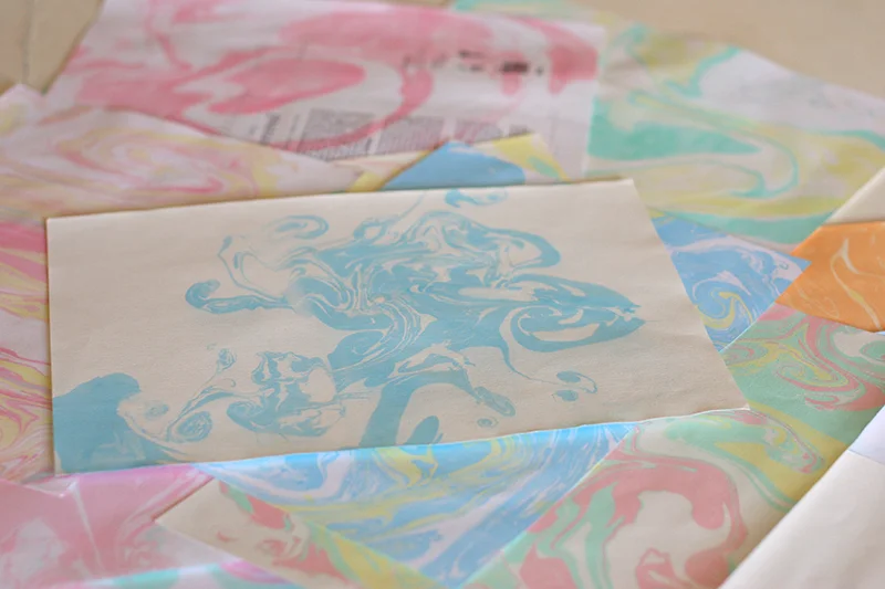
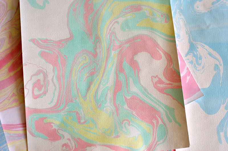
Japanese Marbling Art
I encountered an art called Japanese marbling. I experienced various methods of using different textures of papers making absorb the colour inks, and I found Japanese Shoji paper is the best paper for this. I used these as wrapping paper. Different materials create different patterns, so each wrapping paper is unique.
I keep this project apart from my digital work. It is experiencing and practising graphic design work. Having said that, this project still considers some kinds of usability; "how people hold the bottle, pour the wine. I have to take into account the size of the label, and font sizes. For instance, the writing on the label needs to be more than legible; and the combinations of the texture of the paper and size may make it difficult to hold the bottle so they must be matched appropriately.