Applying AI to real design decisions — competitive benchmarking that killed a low-value feature request, and a token system audit that would have taken days manually. Honest about where AI helped and where it didn't.
A client requested a new data field in Member Online: "Date Joined" — the date a member first joined the fund. No other clients had asked for it. The PM needed a quick answer before we could even consider scope.
The standard response would have been a user research plan. But there was no time, no sessions booked, and the client needed a reply. I made a call: this wasn't a usability question. It was an industry standards question — public information. AI could answer it faster than I could book a single participant.
I ran seven sequential prompts in Perplexity over about 30 minutes — each one building on the last:
| # | Prompt | Intent |
|---|---|---|
| 1 | How do the top 5 largest super funds display "Date Joined"? | Establish the industry baseline |
| 2 | Do any of the top 10 funds show it in Member Online? | Widen the sample |
| 3 | Do smaller funds show it? | Check if it's a scale issue |
| 4 | How do members currently find their Date Joined? | Understand the existing member pathway |
| 5 | Why don't funds show it in Member Online portals? | Surface the structural reasons |
| 6 | If we were to show it, where's the best place? | Generate placement options |
| 7 | Summarise findings as a recommendation for managers | Prepare the output for the PM and BA |
Not one of the top 5 Australian super funds — AustralianSuper, Australian Retirement Trust, Insignia Financial, Hostplus, or Aware Super — displays Date Joined as a field in their member portal. The pattern held across large and small funds alike. The information lives in annual statements, welcome packs, or customer service — not the dashboard.
Perplexity also surfaced why: data integrity issues from fund mergers, no regulatory requirement to surface it online, and low day-to-day relevance to members managing their super.
| Fund | "Date Joined" in portal? | Where members find it |
|---|---|---|
| AustralianSuper | Not displayed | Annual statement, customer service |
| Australian Retirement Trust | Not displayed | Annual statement, welcome pack |
| Insignia Financial (IOOF) | Not displayed | Annual statement, customer service |
| Hostplus | Not displayed | Welcome pack, annual statement |
| Aware Super | Not displayed | Annual statement, customer service |
I presented the findings to the PM and BA with a summary table and a clear recommendation. The project was cancelled. The research was the reason — not a design preference, not a gut call. Evidence from seven sources, assembled in 30 minutes.
This wasn't a research project that needed AI. It was a research project that AI made possible given the constraint. A traditional approach — even a lean one — would have taken days and still relied on publicly available information. Perplexity collapsed that to half an hour.
The judgment call was mine: deciding this was an industry standards question, not a user needs question. AI answered the former. It couldn't have answered the latter.
GROW's design system had evolved across four fund clients. No one had catalogued the inconsistencies. A full manual audit would take the better part of a week. I gave the problem to Claude instead — then validated every finding against the actual system.

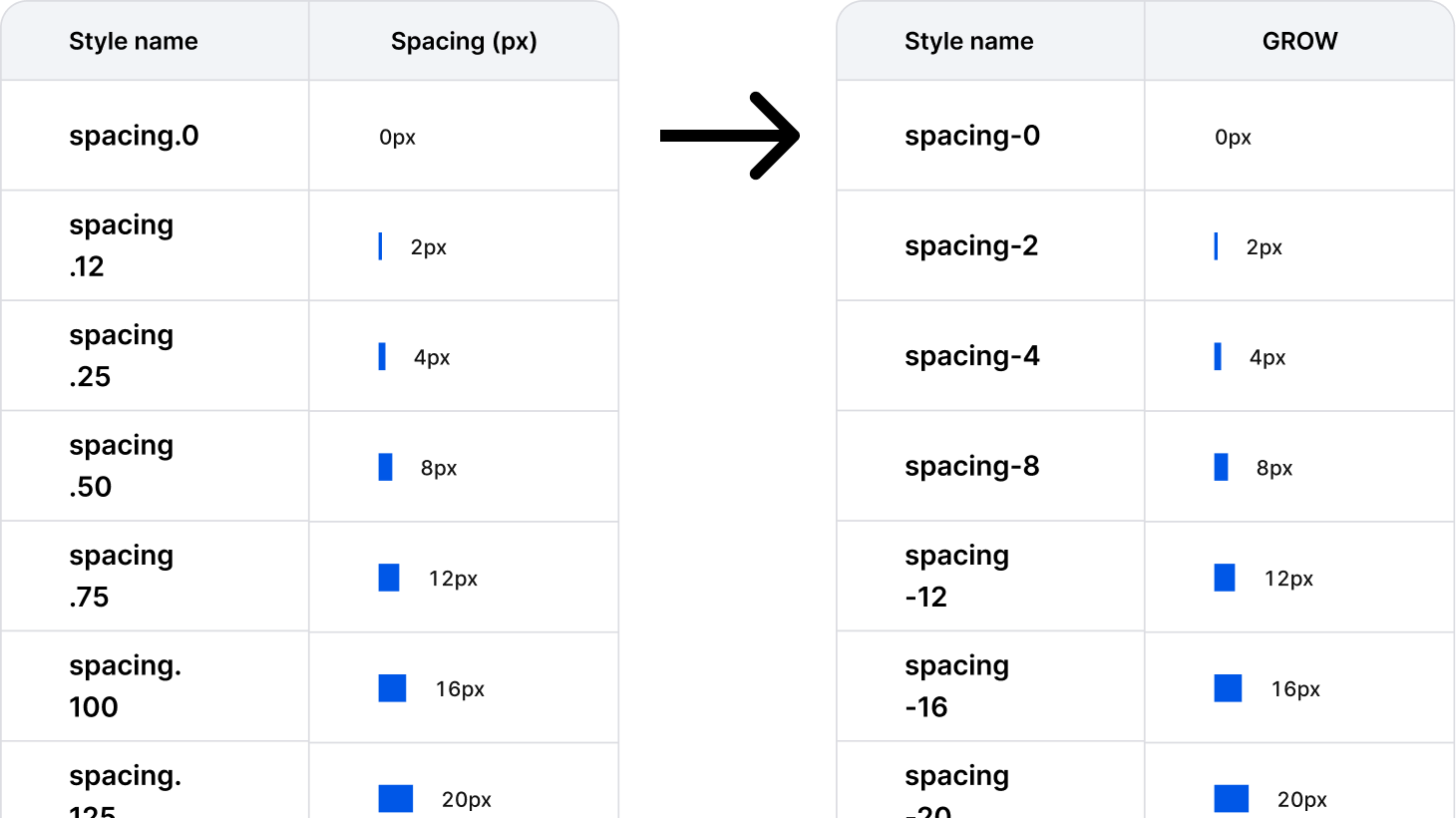
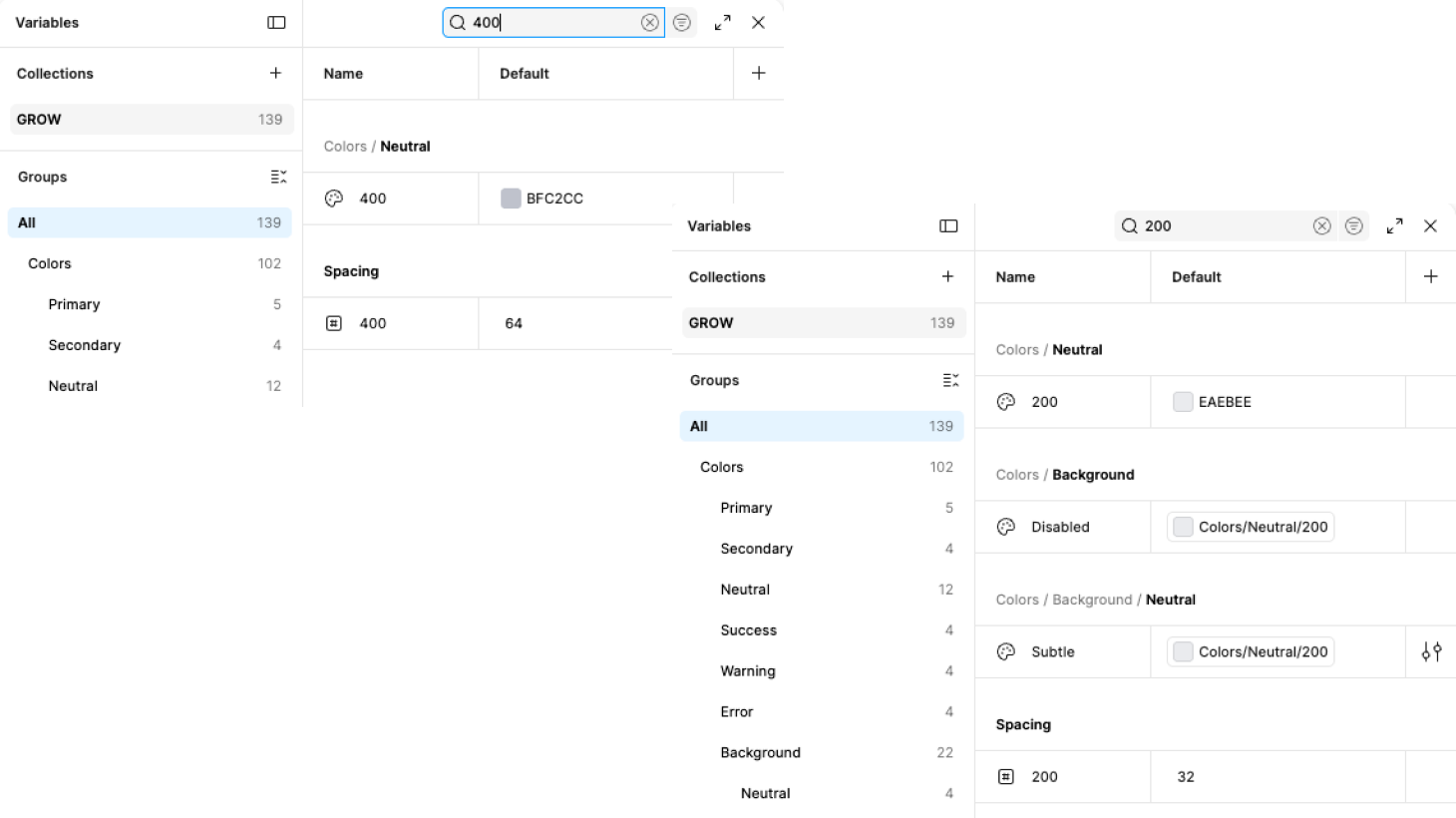
Spacing scale labels (spacing.12, spacing.25, spacing.50…) map to pixel values (2px, 4px, 8px…) with no discernible relationship. No engineer can predict the value from the name.
The fix was to align token names to pixel values (spacing-[px]), which is the industry standard and what engineers expect. No semantic labels needed at the primitive level — semantics belong in the component layer.

Components/Button and Components/Account switcher reference Border Radius/Md directly. That's semantic aliasing, which is good — but only two components are wired up. All other components presumably hardcode radius values.
AI flagged inconsistent border radius aliasing based on inference — it only saw the token list, not the components. On inspection, corner radius values are connected to tokens across components. Finding invalidated.
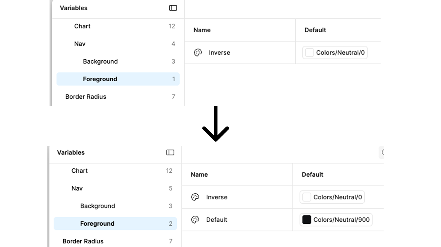
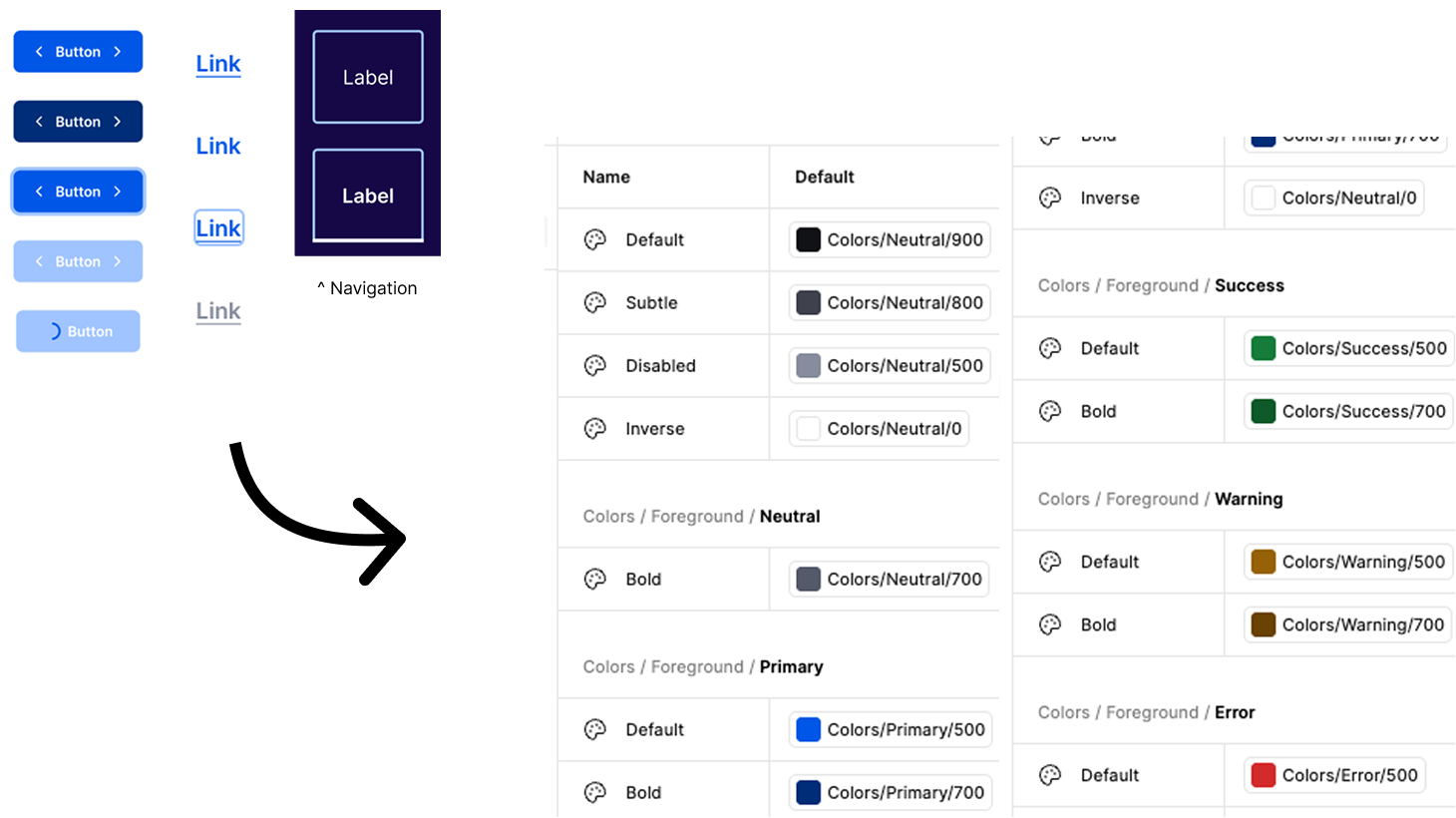
Colors/Nav/Background/[Active, Neutral, Brand] and Colors/Nav/Foreground/[Inverse] sit outside the standard Background/Foreground hierarchy. Nav/Foreground has only one state (Inverse), while all other Foreground groups have Default, Bold, Inverse.
AI flagged Nav/Foreground as structurally incomplete based on pattern asymmetry. Correct finding, wrong reason. The real driver: one client uses a light nav background, making white (Inverse) text invisible. Default foreground token is missing and genuinely needed. Finding upgraded from Minor to Moderate — fix required.
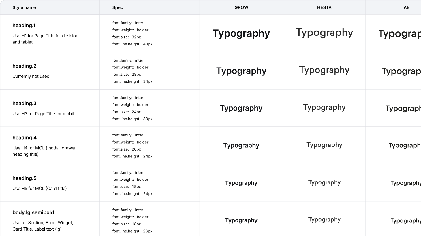
Font family and weight exist, but nothing else. Every component hardcodes its own size and leading. In a white-label system, clients cannot adjust type scale, and engineers have no single source of truth for type decisions. This is the most impactful gap in the system.
AI flagged typography tokens as missing — Critical. Finding invalidated. The Foundations file contains a complete type scale: H1–H5, body.lg/md/sm/xs × semibold/regular, with full specs (size, line-height, weight) documented for all 5 clients. Font family is themeable per client via font/family token. This was the AI's most significant error — it audited the GROW variables panel in isolation and missed an entire Foundations file.

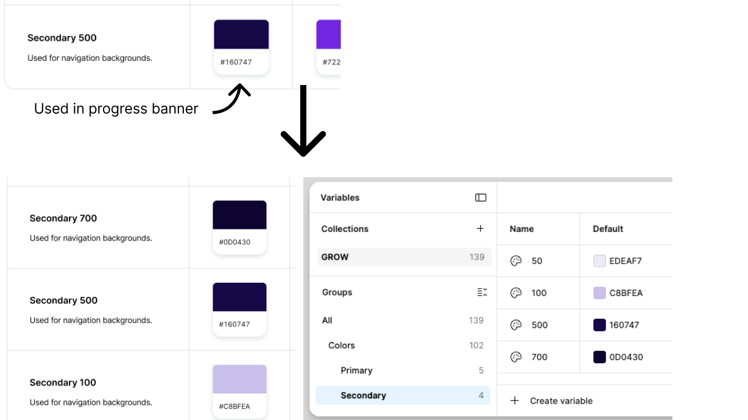
AI flagged Secondary/500 as the only stop — Critical. Confirmed valid. Secondary is not just a nav background — it's used for status banners (e.g. "in progress"). A single stop cannot support the full light/mid/dark pattern required for accessible banner design. Minimum fix: add Secondary/50, Secondary/100, Secondary/700. Full fix: match Primary scale — 50, 100, 300, 500, 700.
Secondary scale gap confirmed. Added 50, 100, 700 stops to defaults. Per-client values documented but not implemented — full fix requires the multi-client mode structure first. Fixes cannot be completed in isolation; the architecture must come first.
Background tokens include Hover and Disabled states. Foreground tokens have Default, Subtle, Disabled, Inverse — but no Hover. Interactive text elements (links, inline actions) have no standard foreground token for hover.
AI flagged missing Foreground/Hover — Moderate. Invalidated after checking three components: (1) Button hover = background changes from Primary/500 to Primary/700, foreground stays Inverse (white). (2) Nav hover = opacity 80%, foreground unchanged. (3) Link hover = underline removed, foreground unchanged. No component uses a foreground colour change on hover. Finding removed.
Flagged against a conventional 100–900 ramp. Invalidated — our scale is intentional. Semantic tokens only reference the stops they need (50, 100, 300, 500, 700).
Finding invalidated. The Primary scale skips 200 and 400 intentionally — semantic tokens only ever need 50 (subtle background), 100 (light background), 300 (mid), 500 (default action), 700 (hover/bold). A conventional 100–900 ramp would add stops with no consumers. No change required.

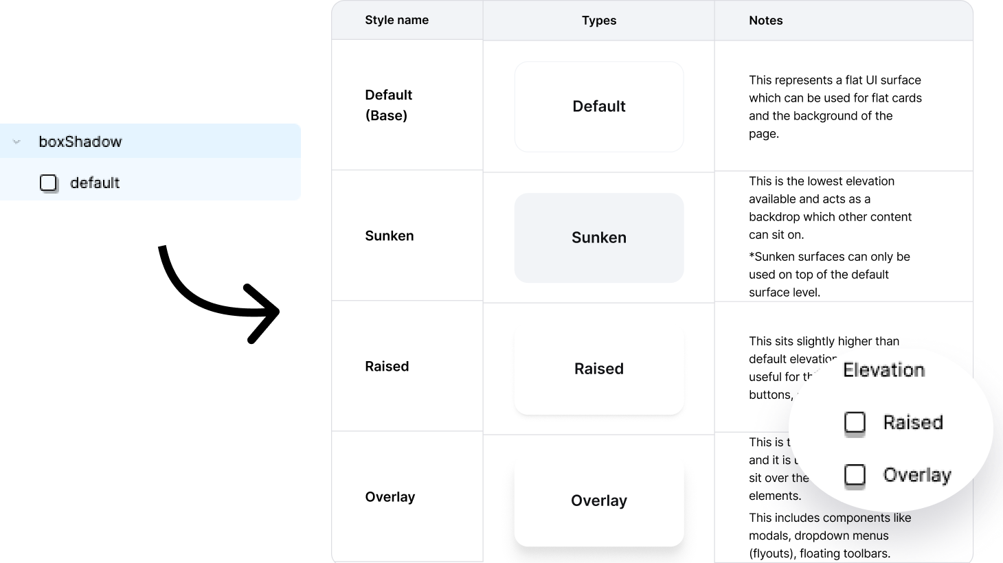
AI flagged missing elevation tokens — Minor. Partially confirmed. Elevation exists as styles (Default, Sunken, Raised, Overlay), but not as a formal variable token set. Shadow values cannot be overridden per client.
AI flagged missing elevation tokens — Partially confirmed. Formalised four elevation levels (Default, Sunken, Raised, Overlay) as variable tokens. Components can now reference them consistently, and clients can override per-brand if needed.
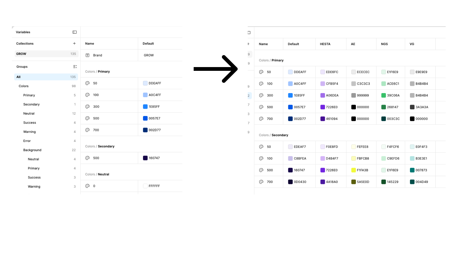
The original file contained a single collection with one Default mode. Onboarding a new client required manually duplicating the file and editing brand values by hand — no way to preview clients side by side, and no single source of truth across the system.
The collection was restructured to support multiple modes — one default and one per client. Each mode overrides only brand-specific primitives such as primary and secondary colours. Shared tokens including neutral, semantic, and spacing values remain consistent across all clients. Onboarding a new client now means adding a mode and overriding brand colours only.
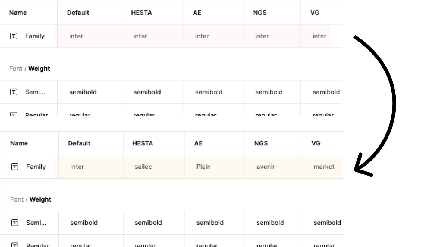
If any client uses a brand typeface (common in super funds that use custom typography, for example), there is no token to override. The font is baked in at the primitive level with no semantic alias above it.
Font/Family token existed but all client modes defaulted to Inter. Updated each client mode with their brand typeface — Sailec, Plain, Avenir, and MarkOT. The token architecture was already correct; the gap was in the mode values, not the structure. One variable, five typefaces, no duplication.
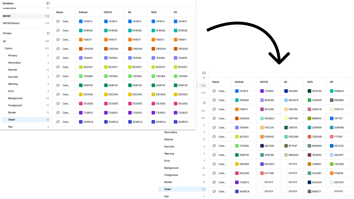
Colors/Chart/Category1–12 use hardcoded hex values. They are not derived from the primitive palette. A client with a brand colour that clashes with Category3 has no path to fix it without manual overrides on every chart instance. In a data-heavy superannuation platform, this affects dozens of visualisations per screen.
Chart colour tokens existed but had no mode overrides — switching themes didn't change chart colours. Per-theme palettes were documented in Foundations but not wired to variables. Fixed by adding all 12 category values across each mode. White (#FFFFFF) intentionally marks unused category slots — a documented design decision, not a gap.
* Several multi-client findings existed because the working file was copied from a single-client baseline — the structure needed rebuilding regardless of origin.
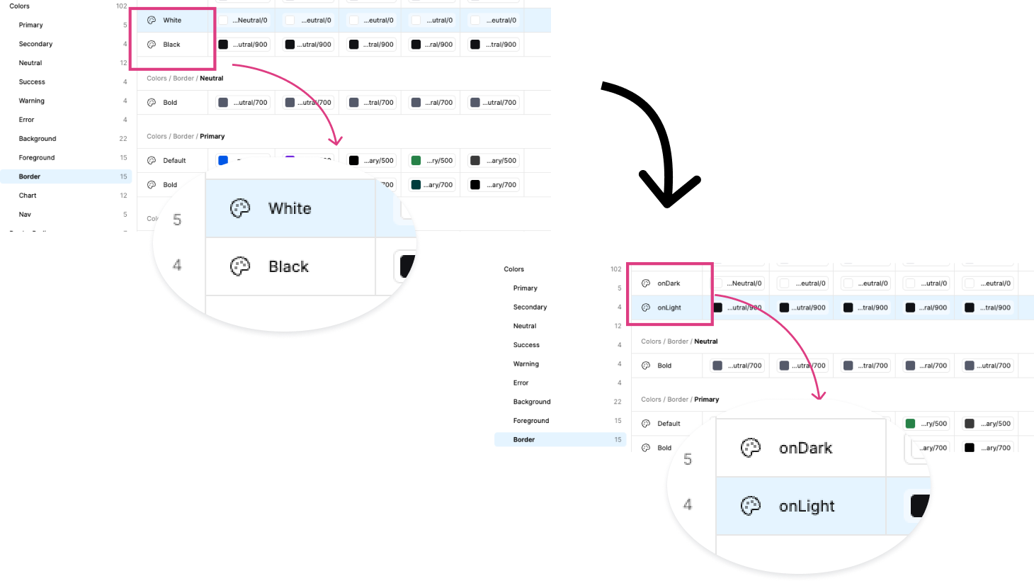
Border/White and Border/Black suggest hardcoded colour rather than semantic intent. In dark mode or on coloured surfaces, "white" and "black" borders are meaningless descriptors and will be misapplied.
Border/White and Border/Black used colour names instead of semantic intent — meaningless on coloured surfaces. Renamed to Border/OnDark and Border/OnLight. Two-minute fix, zero component breakage since values are aliased to Neutral/0 and Neutral/900.
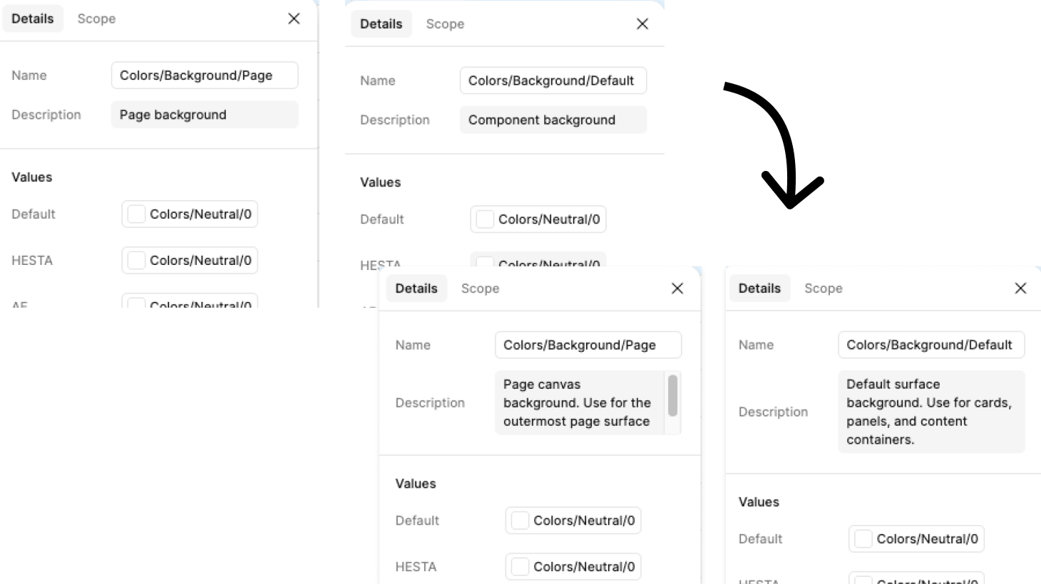
Two top-level background tokens without documented distinction. In practice one is likely the page canvas and one the card/panel surface, but without documentation any designer will apply them arbitrarily.
Background/Page and Background/Default had sparse, ambiguous descriptions — "Page background" and "Component background" — insufficient to distinguish intended use. Updated with explicit usage guidance. No rename needed — renaming would break component references. Description-only fix, zero risk.